
Case study: Viridian brand identity
Project details
Client: Viridian
Industry: Technology Consulting
Timeline: 3 months
Project type: Brand identity + Brand materials
Overview
Viridian is a technology advisory business operating across two distinct audiences: early-stage tech founders (Viridian Velocity) and senior technology leaders (Viridian Vision).
The founders bring strong consulting experience from organisations such as Microsoft, Google, and Gartner. However, the existing brand lacked the visual consistency and refinement needed to clearly reflect this credibility in a competitive consulting market.
The objective of this project was to develop a cohesive visual identity system and a set of practical, scalable report documents to elevate Viridian’s professional presence.
The Challenges
No unified brand identity across Viridian Vision and Viridian Velocity
Need to compete visually with established consulting firms, whose content is highly polished
Requirement to reflect core values: authenticity, agility and growth
Limited in-house design capability and reliance on Microsoft Office tools restricted output quality and consistency
The Solution
1. Brand direction
Evolve and refine the existing visual language already present in Viridian materials
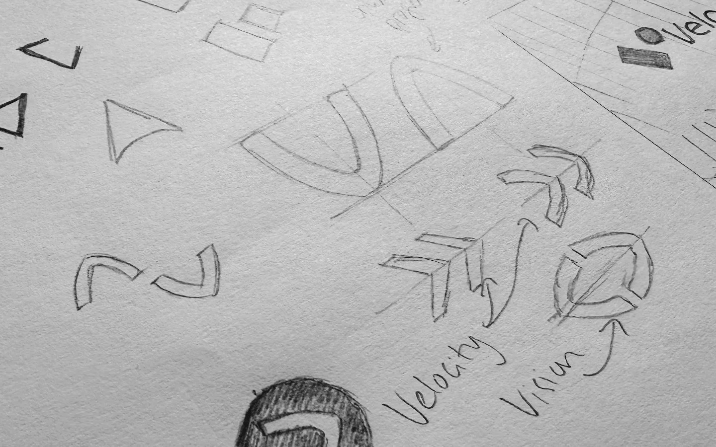
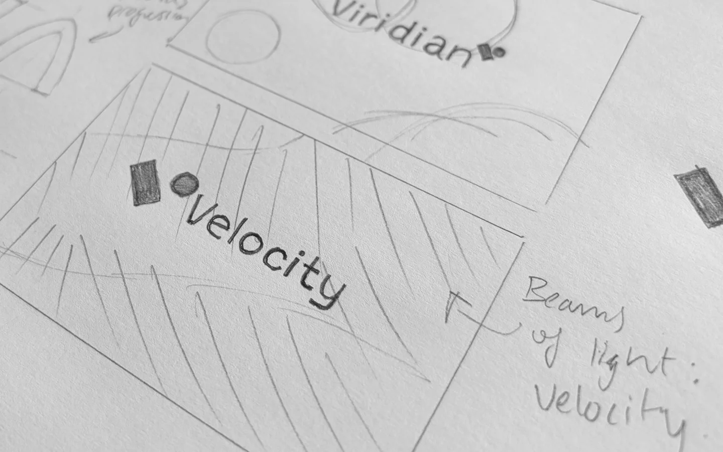
Develop concepts around ‘ideas in motion’ and ‘growth and evolution’
Refine the ‘Viridian’ colour and how it can be used across the two areas of the business
Introduce distinctive, subtle touches that highlight Viridian’s authenticity and personality
2. Dual brand system
Define a clear relationship between Viridian Vision and Viridian Velocity
Create distinction through colour application, graphic forms, and layout hierarchy
Ensure both sub-brands feel independent, while still clearly part of the same family
Create and supply a logo and graphic file suite for future applications
3. Scalable template system
Rather than producing static reports and presentations, a flexible template system was needed to support in-house use and long-term scalability
Deliver templates including PowerPoint presentations and Canva reports
Ensure all templates are built with pre-defined typography, colour styles, and graphic components to ensure consistent brand application
4. Brand Guide
A brand guideline document is needed to outlinine logo usage, colour palette, typography, and supporting graphic elements, including applied examples. This will ensure ongoing consistency across all future outputs.
The Outcome
The new system enables Viridian to:
Produce consistent, high-quality client-facing documents without specialist design support
Maintain brand cohesion across two business areas.
Present a more confident and contemporary visual identity aligned with leading consulting firms
Scale content creation quickly while preserving design quality